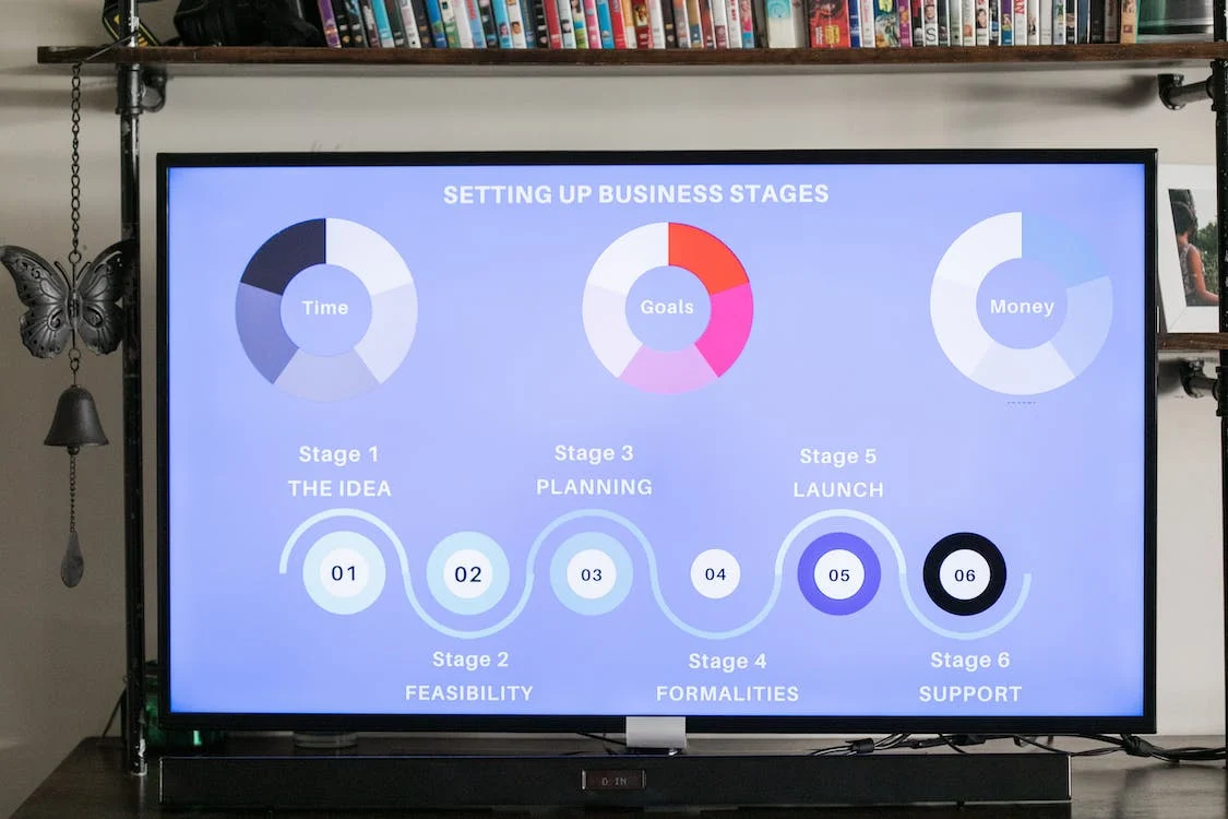
What if you could enhance your marketing plan in a ridiculously simple way?
Choosing an infographic layout is too difficult, or if you’re concerned about making mistakes with infographics, you shouldn’t be. Sure, there’s a small learning curve, but once you get the hang of it, you’ll easily be creating killer graphics in no time.
In this article, we’ll provide you with great information that will help you make awesome infographics.
Want to know more? Keep reading.
-
Cluttered Design
Too much information, colors, icons, and text can make the design look cluttered. To create your infographic, try to keep it clean and simple and focus on one main message.
Try breaking up the content into different sections so the audience isn’t overwhelmed with information when they read it. Follow the rule of thumb—less is more when it comes to a successful design.
-
Lack of Focus
Avoid filling the infographic with extraneous information and try to condense ideas into the fewest number of words possible. Keep design elements consistent by using a visually balanced color palette and related images throughout for a finished look. Make sure your design doesn’t overwhelm the topic or distract away from the message.
Break up the content into well-organized sections and subsections with relevant titles. Incorporate infographic design tools to help the viewer quickly absorb the most important information. Focus on the central theme and make sure your infographic looks clean, professional, and organized.
-
Inaccurate or Poorly Cited Data
Inaccurate or poorly cited data can lead your readers to misperceptions or draw incorrect conclusions. To avoid this, make sure to double-check all data you use before publishing. Make sure the numbers you’re using are up-to-date and come from reliable sources. Additionally, don’t overlook the importance of citing your sources.
Reference where each information point originated to give readers full visibility into the credibility of the data you’re using. When possible, include a link to the original source for further context.
-
Ignoring the Target Audience
It is essential to create a message and aesthetic that resonates with the intended audience, as others may have little interest in the topic or content. If the design does not recognize the target audience’s needs or preferences, the infographic will be rendered ineffective. It is important to tailor the content so that it is relevant to the target audience and also use visuals that are eye-catching and engaging.
The text should be concise, with minimal complicated words and jargon. Furthermore, one should focus on helping the reader understand the main point; providing too much info can be just as off-putting as providing too little.
-
Lack of Visual Hierarchy
Infographics should guide the viewer’s attention through a clear visual hierarchy. Failing to establish a hierarchy can make the infographic confusing and difficult to understand. Use headings, subheadings, and appropriate font styles to structure the content and aid readability.
Start Avoiding Mistakes With Infographics Today
Be aware of these common mistakes with infographics. Understand who your audience is and design with them in mind. Don’t assume too much information, and choose engaging visuals. Really consider the use of color, imagery, and fonts. Take your time to create an effective and engaging infographic. Try it out and track the success of your efforts!
For more such tips, check out our other blog posts. Trust us, and you will love all the great content we have prepared.

No Responses