You are making an important decision by choosing to include visuals in your branding contents, the visuals you are included to support your blogs, magazines, websites and other advertising materials can determine whether clients will stay or leave or which type of client will stay.
With so much pressure on you (as you are the one responsible to choose the visuals), how should you go about selecting the suitable visuals? What are the criteria? What is in trend? This article will help you to understand how customer psychology works and how to use it to your advantage, with this knowledge; you will always stay ahead of competitions.
Before we go into how you can actually win clients over with visual contents, let’s quickly observe some statistical prove on how effective visual contents are:
- Researches have established that content with relevant images attracts 94% more views than content without relevant images.
- More than 60% of senior marketers believe that visual assets (such as videos, photos, infographics, and illustrations) are important to how their brand story is communicated.
- About 50% of marketers say photography is crucial to their current marketing and storytelling techniques.
Visuals are as important as other contents on your websites, quality is and should always be your priority, it is great when your business reflects good aesthetics. This is how to go about it:
First impressions last longer
 When choosing visuals for your website, take extra care to find a visually appealing image or video for the homepage, the homepage is the index of the whole website, it is the face of your website. Let your clients have instant interest in what else you have to offer right from the landing page. From the context of an image alone let them have a glimpse of what your company represents and the messages it communicates.
Appealing visuals will make clients linger on your web and social media pages, they will stop and think about it, trying to go deeper in the message they are receiving, this will make a special connection between the clients and the brand.
If you work hard enough to make first impressions on clients, you will undoubtedly be rewarded with more interest in your brand, and more interest in brand leads to brand growth. For best images, you can check – Depositphotos.
Establish trust
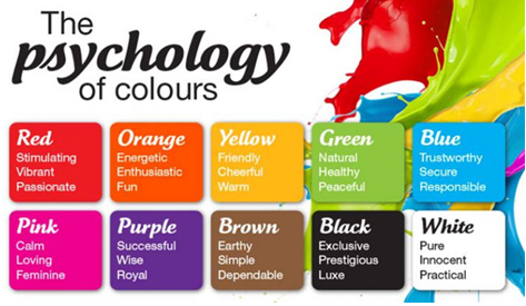
Making people believe in your brand is very important regardless of the nature of your business. You can actually earn clients trust through the proper use of visual contents with the right colors. There should be unity and coherency in your choice of visuals, one of the secrets to achieving this is the color psychology. Color schemes alone can send a message of worthiness to your customers. Similarly, you can also send other messages; for example, blue represents trust and dependability, red communicates energy and excitement.
 Be consistent in a style
Websites, magazines, blogs etc. all have multiple pages; consistency should be seen in visuals across all pages. There should be patterns in your choice of images, typographic positioning, and alignment.
Make use of images that communicate without a word
Sometimes, people go for images that simply represent the keywords or concept of the content. This is a good example to follow but not necessarily the best. As people start going through your content, obvious images will not give them more understanding of your content and this is why you need suitable images to further emphasize some key points. Select clever images that will speak to your clients in multiple ways even without a single character of text displayed on it.
The following example explains the point better; the SCR brand chose a mood-setting image to further emphasize on the atmosphere their product evokes. They did not send a message that only coffee will make things comforting but rather illustrated someone surrounded by other comforting settings but that wouldn’t be completed without a cup of coffee.
 Put down your ego and learn from your competitors
Sometimes, the idea we need to grow our business is right there in the hands of our competitors, but our egos wouldn’t let us go for it. It is an uncommon practice to take a look at how competitors handle their visual contents, but there are potentials in it. Study your competitors, using the reasons behind their branding success and failures to make your business better.
Visual contents are not only images and stock photographs, there are other design elements that are as effective:
#1. Video
 A video is an ideal visual when presenting common problems and then giving the solutions that your product can offer. Though the most expensive form of visual designs, but also represents the evidence that you are prepared to go extra miles for quality. A study showed that including a video on a landing page increased conversions by 86%. Various types of videos that you can use to enhance your business include; how-to videos, demonstrations or customer testimonials, animated explainer videos etc. whichever one you choose, make sure it is of high quality with good sound. If it is an explainer video, ensure that the narrator has a good accent with a clear voice.
#2. Infographics
 Infographics is a very useful tool when breaking down complex data and representing them with an easily intelligible visual display. With the right usage, infographics can become an integral part of your content marketing strategy.
To get the best out of infographics, you should pay more attention to the layout and design, the collective power of colors, texts and shapes should be used to convey meaningful information to your audience. The information you will be sending in infographics should be contextually relevant and accurate.
You can bring the most seemingly mundane statistics back to life with infographics.
#3. Memes
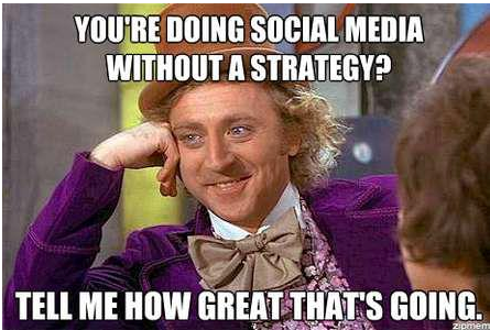 Memes are primarily meant for sharing information but with humor. Due to its entertainment usage, only a few people see it as something that is useful in business settings. A meme is a great way to initiate positive emotions and make your messages well received. But firstly, you must determine whether a meme is appropriate for your brand’s niche, if your brand deals mostly with younger demographic then it is good, but if not, do not even think about using it.
#4. Presentations
 Create a series of slides to convey large information in smaller units. This tool is very useful when there is a need to engage the audience with consecutive groups of information.
Other visual contents you can use to engage audience are tables, screenshots, GIF e.t.c
You may also like :

No Responses